The City of Toronto recently began a pilot project to speed up transit traffic on King Street through the downtown core. The project entails changes along the busiest 2.6km stretch, whose main aim is to clear non-local auto-traffic from the transit-way. Parts of the street have been pedestrianized, many transit stops have been relocated to the far side of traffic lights, and stop bump-outs have been created and bollarded off from traffic. Probably the most important change however is the complex set of turn restrictions (which can be seen in detail here) which apply only to private cars (at all times) and taxis (except at night). These have the effect of clearing King Street of all but the most local, block-bound auto-traffic, while allowing transit users, cyclists, and pedestrians a more complete freedom of movement.
You can read about the whole pilot project on the City’s website. It’s really quite a bold move for a city these days, but one that is warranted by the fact that even with the sometimes remarkably slow transit service in this corridor, the city estimates that there are more transit users than private vehicles by a ratio of more than 3 to 1 (65k transit trips vs 20k daily vehicles).
The pilot project has been in place for a bit more than a week now, and we here in the SAUSy lab were wondering how it’s going. For my own (unrelated) dissertation work, I’ve been collecting GPS data from TTC’s entire surface fleet for almost a month now. This gives us a nice opportunity to have a little before/after comparison: have transit services actually sped up as a result of the changes?
The data we have are essentially GPS traces for each transit trip with associated timestamps. The sampling interval is about 20 seconds on average and the data comes from the NextBus API, which is what’s behind any real-time transit apps you may be used to using.
We wanted to measure travel times through the effected area, which is used by three different routes. The #504 and #514 are operated by streetcars, while the #304 is a night-only bus following the route of the #504. Below is a quick-and-dirty map of the overlaid GPS tracks for the three routes (red) and the limits (blue) of the pilot project area.
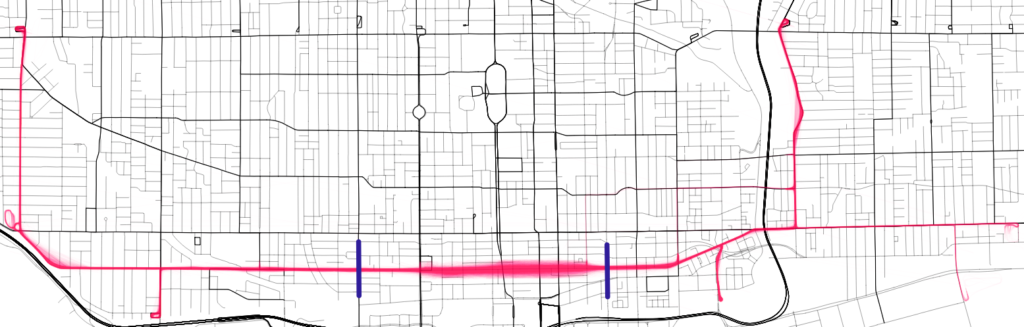
There were about 14,000 trips in our dataset that traversed the study area, ~11,300 before the project implementation and ~3,500 post implementation. To estimate the travel time across the study area, we took an inverse distance weighted average of the timestamps on each trip that were within 150 meters of each of the study area boundaries. Or in simpler terms, we measured the time a vehicle entered and exited the study area shown above.
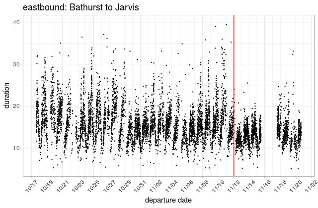
A plot of total travel times through the study area (below) shows 1) that we have a bit of missing data (my bad), 2) that there is a clear daily and maybe weekly periodicity in travel times and, 3) if you squint that there may be a regime change somewhere around Nov 12th, which indeed is when the pilot project officially went into effect (red line).
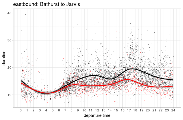
To take a closer look at the effects here, we’ll need to zoom in on the daily pattern. The following chart takes all the data from the above chart and overlays it on a single day.
| Mean travel time | Median | |
|---|---|---|
| Pre-pilot | 16.3 | 15.4 |
| Post-pilot | 13.8 | 13.5 |
The pre-pilot (black) shows a typical daily pattern with morning and afternoon peaks in travel time. The quickest average speed through the study area happens around 3-5 am with ~9-10 minutes needed to get from Bathurst to Jarvis. Presumably, that’s more or less the base time needed to get through all the lights and stop at most of the stops with minimal on-board crowding. During the pre-pilot period, the worst of the afternoon peak was at least twice that on average, though a different smoothing parameter could have resulted in a more peaky peak for the momentary average. Looking at the points themselves, I might be inclined to guess something more like 22-23 minutes as a maximum daily average.
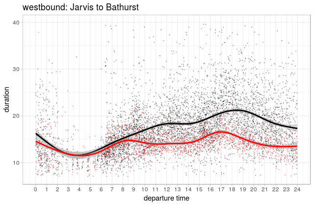
The post-pilot times (red) however show a dramatic reduction in average travel times, kind of lopping the peaks off the rush hours. The same plot, but for the west-bound trips shows a somewhat different curve for both lines, but again, the big story seems to be the ~25% reduction in average travel times during the times when most people are riding.
| Mean travel time | Median | |
|---|---|---|
| Pre-pilot | 18.0 | 16.8 |
| Post-pilot | 14.7 | 14.2 |
I’d be willing to venture a guess that the variability in travel time is down substantially as well, but I’ll save that analysis until we have at least another week’s data. Really, we should wait until we have more data generally before drawing any real conclusions, but it looks like the pilot project is off to a good start, and immediately making a big difference in travel times for most people going through the area.
We’ll probably take another look at this issue as more data comes in, and I’m happy to share our data with anyone who requests it. I won’t link to here though since the dataset is still growing.
Also, I’d like to give thanks (happy American Thanksgiving!!) for Jeff Allen who did all of the charts and GIS analysis for this post! Jeff is finishing up a master’s degree this year, but with luck may be sticking around for another degree or two in the SAUSy Lab.