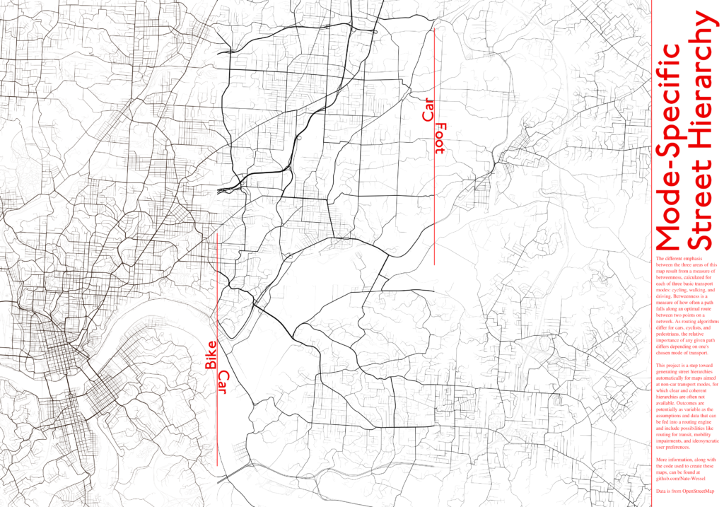
This lovely map comes to us courtesy of JieLan Xu, long-time SAUSy Lab affiliate:
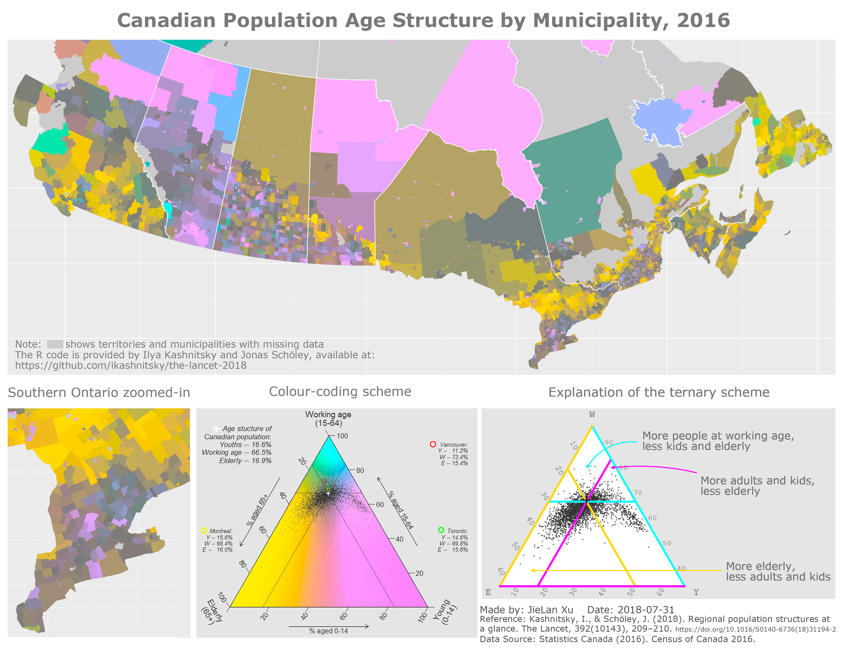
This lovely map comes to us courtesy of JieLan Xu, long-time SAUSy Lab affiliate:
Last week, we looked at transit data from the area around the King Street pilot project and noted increased average streetcar speeds across most times of day in the area effected by the project. There were a lot of things that we didn’t address in that post though: headway variability, congestion effects on nearby streets, and variability in travel times to indicate just a few. In this post, we’ll be taking a closer look at variability in travel times through the pilot project area (King Street between Bathurst and Jarvis). We’ll also take a quick look at a control case on a different section of King Street to see if travel times changed there as well or just in the section directly effected by the pilot. There’s a lot more to be done on this topic, but we’re just going to eat this elephant one bite at a time.
So! We’ve accumulated about another week’s worth of data, and now have about 27 days of pre-pilot observation, 16 days post.
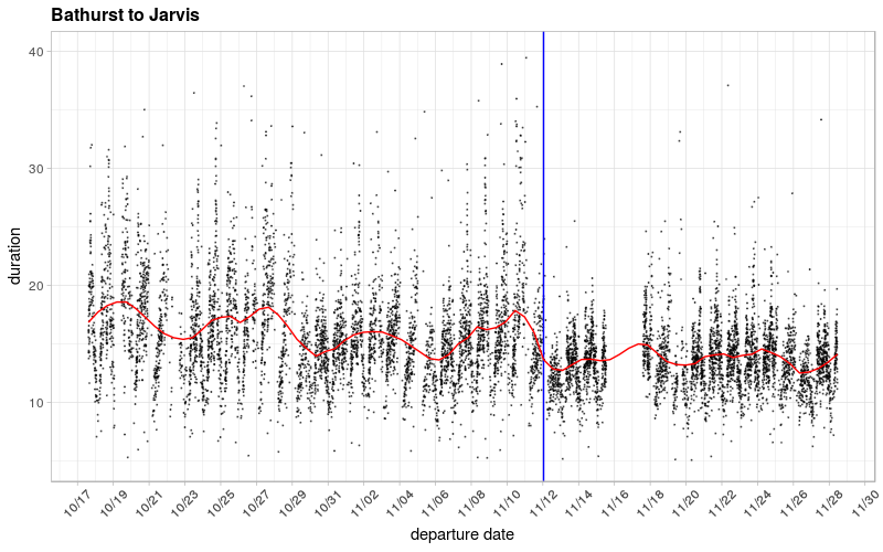
As we noted before, the above chart seems to show a pretty clear change between mean travel times before and after the change. We looked at this as a smoothed average over the course of the day and saw that indeed, mean travel times appear to be falling, especially in the peaks when most people are travelling, and when the pilot project presumably makes the biggest cut in automobile traffic.
What we didn’t explore last time was the variability around that mean, which is an important measure of reliability. But before I get any further, I want to note right up front that what we’re measuring here is the time it takes a vehicle (streetcar or bus) to go between two points (Bathurst and Jarvis), while the actual experience of using transit involves waiting for that vehicle to show up as well. Ideally we’d be looking at a measure of end-to-end travel times including waiting and in-vehicle travel (e.g.) though, alas, this isn’t an easy thing to do for a variety of complicated reasons. Figuring out how to do this properly is the subject of my dissertation research, but this dataset isn’t quite ready for that kind of analysis just yet.
Still, to move forward with what we do have, we can take a closer look at how the distribution of vehicle travel times changes throughout the day, similar to what we did before with the mean. In the plot below, we can see the median travel times (blue line) along with ranges for the 5th to 95th percentiles (red) and 25-75th percentiles (purple).
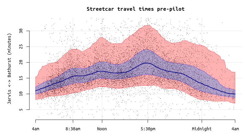
One way to interpret this, if it helps, is that 90% of trips are inside the red area, 50% inside the purple one. The wider the bands, the more variability there is in travel times. In the peak of the peak for the pre-pilot data, about 5% of trips were taking more than about 31-32 minutes.
The same plot for the post-pilot data shows a much tighter range, with less variability during the times when most people are riding. Median (and average) travel times are also down substantially, except during the early morning hours when there wasn’t much room for improvement anyway.
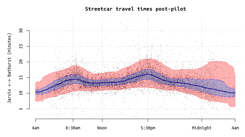
During the peak of the peak here, the slowest %5 of trips are taking more than ~21 minutes, a full ten minute gain on the pre-pilot scenario of 31-32 minutes seen above.
Another way of looking at variability is that old classic, the histogram. The chats below are essentially a cross-sectional view of the evening rush-hours in the two charts just above. You can see that in the pre-pilot case (top), travel times have a much wider spread than in the post-pilot (bottom) where they’re much more tightly clustered toward the lower end of the previous distribution.
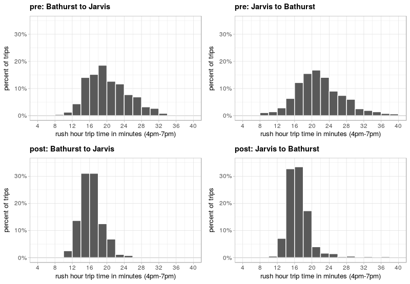
And for the old-school among you, a table for the evening rush hour period.
| mean | 25th pct. | median | 75th pct. | 90th pct | stdv | ||
|---|---|---|---|---|---|---|---|
| Bathurst to Jarvis | Before | 20.6 | 16.6 | 19.7 | 23.6 | 27.3 | 6.1 |
| After | 16.4 | 14.5 | 16.1 | 17.7 | 19.8 | 2.9 | |
| Jarvis to Bathurst | Before | 22.8 | 18.2 | 21.5 | 25.3 | 30.0 | 8.3 |
| After | 17.3 | 15.3 | 16.4 | 18.2 | 19.9 | 5.7 |
One more interesting statistic, if percentiles aren’t your thing: before the pilot, 19% of trips during the evening peak (4-7pm) were taking longer than 25 minutes, compared to just 1.3% after.
…
After our first post on this topic, a number of people wrote to ask about congestion effects on the Queen Street line. The King Street pilot works essentially by diverting private cars away from King Street, so it’s reasonable to assume that car traffic has become worse on surrounding streets, at least for a while since it takes time for people to change their habits and shuffle themselves around to new and more convenient places. I’d love to be able to do the same kind of analysis for the section of Queen Street just north of the pilot, but the issue is muddied by the fact that the Queen line has been regularly diverting around construction in that area, and actually sending many streetcars down to King.
This got me thinking however about using Queen, or some other street as a control case to ensure that the effects we were seeing were indeed due to the pilot project rather than to, say, something that effects streetcars generally like weather, holidays or plagues of locusts. To check that, we looked at another stretch of the same King Street line, Bathurst to Dufferin, which has roughly the same length, and more or less precisely the same level of service1.

It’s hard to visually make out any change between the before and after periods, so that’s reassuring. A statistical test reveals however that there is actually a significant difference between the two periods, small though it is: 8.46 minutes before, 8.27 after. This compares to 16.97 minutes before to 14.02 minutes after for the pilot area.
…
Anyway, We’ll likely have more analysis on this topic coming down the pipeline in the days ahead. I’m working now on calculating travel times that include waiting time and thus information on the headway variation.
As before, shout-outs go to Jeff Allen and Steven Farber, without whom this analysis would have been substantially less pleasurable and more time consuming.
The City of Toronto recently began a pilot project to speed up transit traffic on King Street through the downtown core. The project entails changes along the busiest 2.6km stretch, whose main aim is to clear non-local auto-traffic from the transit-way. Parts of the street have been pedestrianized, many transit stops have been relocated to the far side of traffic lights, and stop bump-outs have been created and bollarded off from traffic. Probably the most important change however is the complex set of turn restrictions (which can be seen in detail here) which apply only to private cars (at all times) and taxis (except at night). These have the effect of clearing King Street of all but the most local, block-bound auto-traffic, while allowing transit users, cyclists, and pedestrians a more complete freedom of movement.
You can read about the whole pilot project on the City’s website. It’s really quite a bold move for a city these days, but one that is warranted by the fact that even with the sometimes remarkably slow transit service in this corridor, the city estimates that there are more transit users than private vehicles by a ratio of more than 3 to 1 (65k transit trips vs 20k daily vehicles).
The pilot project has been in place for a bit more than a week now, and we here in the SAUSy lab were wondering how it’s going. For my own (unrelated) dissertation work, I’ve been collecting GPS data from TTC’s entire surface fleet for almost a month now. This gives us a nice opportunity to have a little before/after comparison: have transit services actually sped up as a result of the changes?
The data we have are essentially GPS traces for each transit trip with associated timestamps. The sampling interval is about 20 seconds on average and the data comes from the NextBus API, which is what’s behind any real-time transit apps you may be used to using.
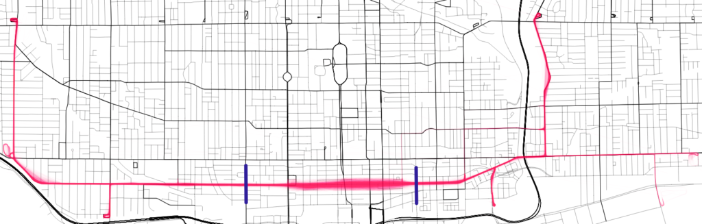
We wanted to measure travel times through the effected area, which is used by three different routes. The #504 and #514 are operated by streetcars, while the #304 is a night-only bus following the route of the #504. Below is a quick-and-dirty map of the overlaid GPS tracks for the three routes (red) and the limits (blue) of the pilot project area.
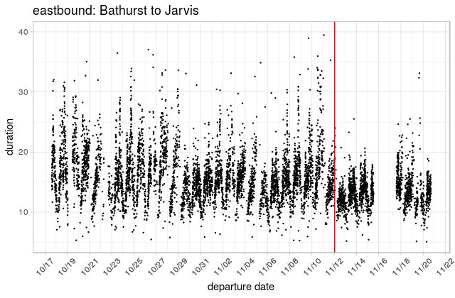
There were about 14,000 trips in our dataset that traversed the study area, ~11,300 before the project implementation and ~3,500 post implementation. To estimate the travel time across the study area, we took an inverse distance weighted average of the timestamps on each trip that were within 150 meters of each of the study area boundaries. Or in simpler terms, we measured the time a vehicle entered and exited the study area shown above.
A plot of total travel times through the study area (below) shows 1) that we have a bit of missing data (my bad), 2) that there is a clear daily and maybe weekly periodicity in travel times and, 3) if you squint that there may be a regime change somewhere around Nov 12th, which indeed is when the pilot project officially went into effect (red line).
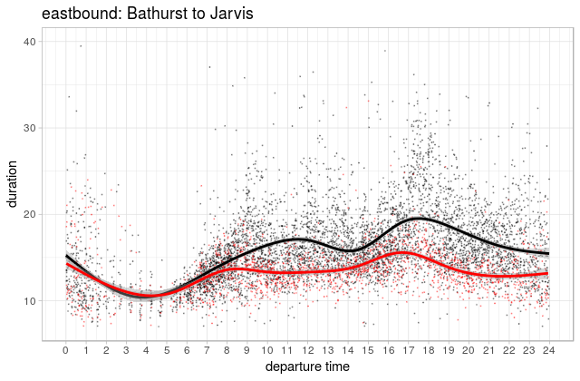
To take a closer look at the effects here, we’ll need to zoom in on the daily pattern. The following chart takes all the data from the above chart and overlays it on a single day.
| Mean travel time | Median | |
|---|---|---|
| Pre-pilot | 16.3 | 15.4 |
| Post-pilot | 13.8 | 13.5 |
The pre-pilot (black) shows a typical daily pattern with morning and afternoon peaks in travel time. The quickest average speed through the study area happens around 3-5 am with ~9-10 minutes needed to get from Bathurst to Jarvis. Presumably, that’s more or less the base time needed to get through all the lights and stop at most of the stops with minimal on-board crowding. During the pre-pilot period, the worst of the afternoon peak was at least twice that on average, though a different smoothing parameter could have resulted in a more peaky peak for the momentary average. Looking at the points themselves, I might be inclined to guess something more like 22-23 minutes as a maximum daily average.
The post-pilot times (red) however show a dramatic reduction in average travel times, kind of lopping the peaks off the rush hours. The same plot, but for the west-bound trips shows a somewhat different curve for both lines, but again, the big story seems to be the ~25% reduction in average travel times during the times when most people are riding.
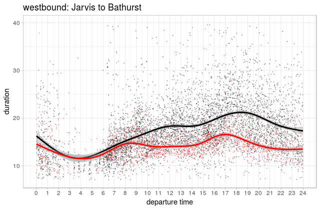
| Mean travel time | Median | |
|---|---|---|
| Pre-pilot | 18.0 | 16.8 |
| Post-pilot | 14.7 | 14.2 |
I’d be willing to venture a guess that the variability in travel time is down substantially as well, but I’ll save that analysis until we have at least another week’s data. Really, we should wait until we have more data generally before drawing any real conclusions, but it looks like the pilot project is off to a good start, and immediately making a big difference in travel times for most people going through the area.
We’ll probably take another look at this issue as more data comes in, and I’m happy to share our data with anyone who requests it. I won’t link to here though since the dataset is still growing.
Also, I’d like to give thanks (happy American Thanksgiving!!) for Jeff Allen who did all of the charts and GIS analysis for this post! Jeff is finishing up a master’s degree this year, but with luck may be sticking around for another degree or two in the SAUSy Lab.
Who posts the posters?
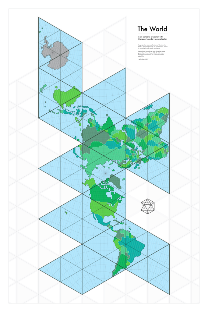
We do. These are the SAUSy lab entries to the NACIS 2017 map and poster gallery. The first is by the famous Jeff Allen, the second by my humble self, Nate Wessel. We’re looking forward to the first Canadian NACIS conference in 23 years, taking place October 10-13 in Montreal!
Some photos from our trip to the 2017 conference of the Canadian Cartographic Association in Ottawa:
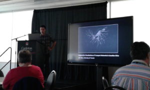
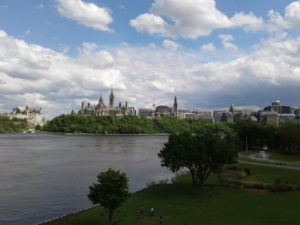
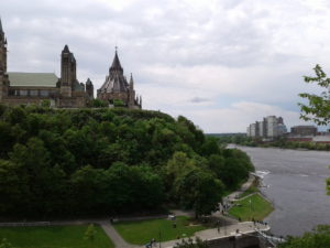
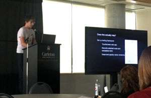
Nate Wessel and Jeff Allen of the SAUSy Lab, and Byron Moldofsky of the U of T Cartography Office all presented recent work.
The following paper has recently been accepted for publication by the Journal of Transport Geography:
Constructing a Routable Retrospective Transit Timetable from a Real-time Vehicle Location Feed and GTFS
Nate Wessel, Jeff Allen & Steven Farber
Abstract
We describe a method for retroactively improving the accuracy of a General Transit Feed Specification (GTFS) package by using a real-time vehicle location dataset provided by the transit agency. Once modified, the GTFS package contains the observed rather than the scheduled transit operations and can be used in research assessing network performance, reliability and accessibility. We offer a case study using data from the Toronto Transit Commission and find that substantial aggregate accessibility differences exist between scheduled and observed services. This ‘error’ in the scheduled GTFS data may have implications for many types of measurements commonly derived from GTFS data.
Check us out at the 2017 AAG! SAUSy affiliated presentations and abstracts in the links below:
Exploring the relationship between food shopping behaviour and transportation with time use data
A Systematic Review of Activity Spaces and Food-related Behaviours
Neighborhood context of aging-in-place: mapping the spatial patterns of aging in Canada
Transportation behaviours of single-person households in a Canadian context
Modelling the Effects of Space on Emergency Medical Transportation in Maryland, USA
Dwelling Type Matters: Untangling the Paradox of Dwelling Type and Mode Choice
(By Trudy Ledsham, Steven Farber, and Nate Wessel) has just been accepted to the Transportation Research Record!
Abstract:
Urban intensification is believed to result in modal shift away from automobiles to more active forms of transportation. This work extends our understanding of bicycle mode choice and the influence of built form, through analysis of dwelling type, density and mode choice. Both apartment dwelling and active transportation are related to intensification, but our understanding of the impact of increased density on bicycling is muddied by lack of isolation of cycling from walking in many studies, and lack of controls for the confounding effects of dwelling type. This paper examines the relationship between dwelling type and mode choice in Toronto. Controlling for 25 variables, this study of 223,232 trips used multinomial logistic regression analysis to estimate relative risk ratios. Compared to driving, we found strong evidence that a trip originating from an apartment-based household was less than half as likely to be taken by bicycle as a similar trip originating in a house-based household in Toronto in 2011. Increased population density of the household location had a positive impact on the likelihood of a trip being taken by walking and a negligible and uncertain impact on the likelihood of it being taken by transit, but a
negative impact on bicycling. Further analysis found the negative impact of density does not seem to apply to those living in single detached housing, but rather it only negatively impacts the likeliness of cycling among apartment and townhouse dwellers. Further research is required to identify the exact barriers to cycling, apartment dwellers experience.
Unfortunately, we cannot provide a direct link to the paper at this time, but we’ll provide a link to TRR once the paper is published.
Hi there. Welcome to the SAUSy Lab at the University of Toronto. Not only are we a relatively new group, but we only just got a website. Lucky us! Lucky you!
One of the things about having a website, like writing a brochure or constructing your own home is that you have to put into tangible form a lot of messy, unresolved, still-evolving arrangements and ideals, not all of which everyone will agree on or has even tried to articulate before. For example, is this too casual a tone? Should it be dry and academic? Let’s try the first and see if anyone cares!
So what is the SAUSy lab? In general terms, if I must be stretched to provide an initial draft, the SAUSy Lab is a group of researchers, two professors and six graduate students, working on issues around transportation and quantitative method from a geographic or urban planning perspective. A couple subspecialties are cartography, health geography, and open-source GIS. As I say though, that is all still up in the air so if you don’t find that definition to be to your satisfaction, the best thing to do is either to give up because you didn’t care that much anyway, or to reach out to one of us and ask questions. If you’re considering applying to work with us, or if you already have, we do hope you’ll adopt the latter strategy!