Last week, we looked at transit data from the area around the King Street pilot project and noted increased average streetcar speeds across most times of day in the area effected by the project. There were a lot of things that we didn’t address in that post though: headway variability, congestion effects on nearby streets, and variability in travel times to indicate just a few. In this post, we’ll be taking a closer look at variability in travel times through the pilot project area (King Street between Bathurst and Jarvis). We’ll also take a quick look at a control case on a different section of King Street to see if travel times changed there as well or just in the section directly effected by the pilot. There’s a lot more to be done on this topic, but we’re just going to eat this elephant one bite at a time.
So! We’ve accumulated about another week’s worth of data, and now have about 27 days of pre-pilot observation, 16 days post.
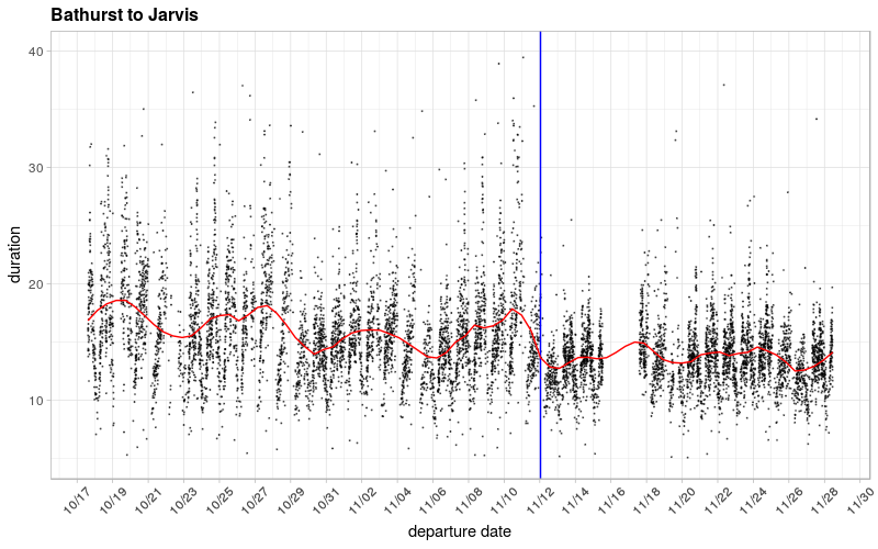
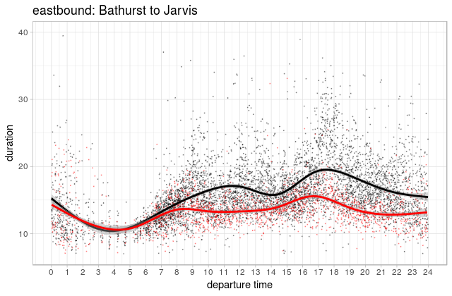
As we noted before, the above chart seems to show a pretty clear change between mean travel times before and after the change. We looked at this as a smoothed average over the course of the day and saw that indeed, mean travel times appear to be falling, especially in the peaks when most people are travelling, and when the pilot project presumably makes the biggest cut in automobile traffic.
What we didn’t explore last time was the variability around that mean, which is an important measure of reliability. But before I get any further, I want to note right up front that what we’re measuring here is the time it takes a vehicle (streetcar or bus) to go between two points (Bathurst and Jarvis), while the actual experience of using transit involves waiting for that vehicle to show up as well. Ideally we’d be looking at a measure of end-to-end travel times including waiting and in-vehicle travel (e.g.) though, alas, this isn’t an easy thing to do for a variety of complicated reasons. Figuring out how to do this properly is the subject of my dissertation research, but this dataset isn’t quite ready for that kind of analysis just yet.
Still, to move forward with what we do have, we can take a closer look at how the distribution of vehicle travel times changes throughout the day, similar to what we did before with the mean. In the plot below, we can see the median travel times (blue line) along with ranges for the 5th to 95th percentiles (red) and 25-75th percentiles (purple).
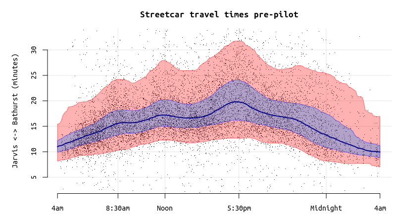
One way to interpret this, if it helps, is that 90% of trips are inside the red area, 50% inside the purple one. The wider the bands, the more variability there is in travel times. In the peak of the peak for the pre-pilot data, about 5% of trips were taking more than about 31-32 minutes.
The same plot for the post-pilot data shows a much tighter range, with less variability during the times when most people are riding. Median (and average) travel times are also down substantially, except during the early morning hours when there wasn’t much room for improvement anyway.
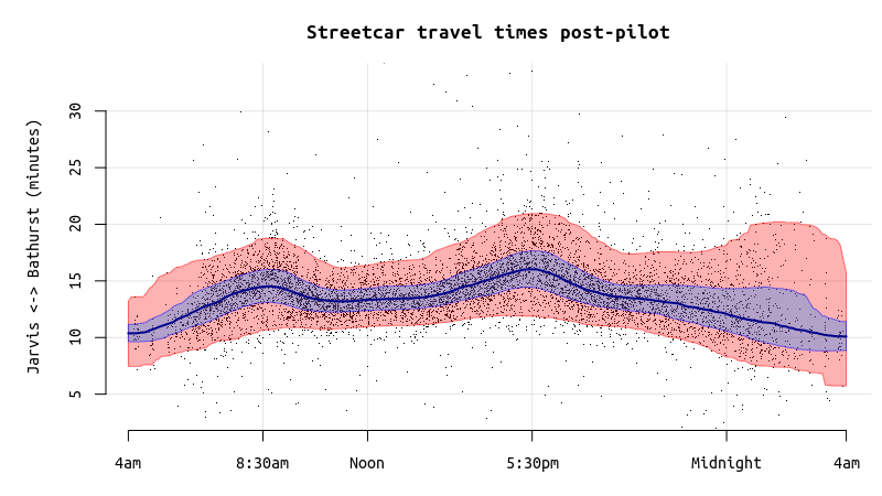
During the peak of the peak here, the slowest %5 of trips are taking more than ~21 minutes, a full ten minute gain on the pre-pilot scenario of 31-32 minutes seen above.
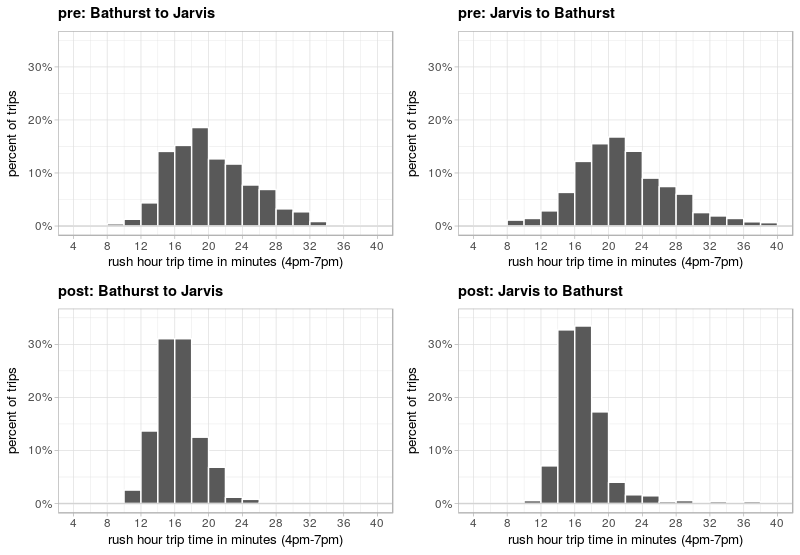
Another way of looking at variability is that old classic, the histogram. The chats below are essentially a cross-sectional view of the evening rush-hours in the two charts just above. You can see that in the pre-pilot case (top), travel times have a much wider spread than in the post-pilot (bottom) where they’re much more tightly clustered toward the lower end of the previous distribution.
And for the old-school among you, a table for the evening rush hour period.
| mean | 25th pct. | median | 75th pct. | 90th pct | stdv | ||
|---|---|---|---|---|---|---|---|
| Bathurst to Jarvis | Before | 20.6 | 16.6 | 19.7 | 23.6 | 27.3 | 6.1 |
| After | 16.4 | 14.5 | 16.1 | 17.7 | 19.8 | 2.9 | |
| Jarvis to Bathurst | Before | 22.8 | 18.2 | 21.5 | 25.3 | 30.0 | 8.3 |
| After | 17.3 | 15.3 | 16.4 | 18.2 | 19.9 | 5.7 |
One more interesting statistic, if percentiles aren’t your thing: before the pilot, 19% of trips during the evening peak (4-7pm) were taking longer than 25 minutes, compared to just 1.3% after.
…
After our first post on this topic, a number of people wrote to ask about congestion effects on the Queen Street line. The King Street pilot works essentially by diverting private cars away from King Street, so it’s reasonable to assume that car traffic has become worse on surrounding streets, at least for a while since it takes time for people to change their habits and shuffle themselves around to new and more convenient places. I’d love to be able to do the same kind of analysis for the section of Queen Street just north of the pilot, but the issue is muddied by the fact that the Queen line has been regularly diverting around construction in that area, and actually sending many streetcars down to King.
This got me thinking however about using Queen, or some other street as a control case to ensure that the effects we were seeing were indeed due to the pilot project rather than to, say, something that effects streetcars generally like weather, holidays or plagues of locusts. To check that, we looked at another stretch of the same King Street line, Bathurst to Dufferin, which has roughly the same length, and more or less precisely the same level of service1.

It’s hard to visually make out any change between the before and after periods, so that’s reassuring. A statistical test reveals however that there is actually a significant difference between the two periods, small though it is: 8.46 minutes before, 8.27 after. This compares to 16.97 minutes before to 14.02 minutes after for the pilot area.
…
Anyway, We’ll likely have more analysis on this topic coming down the pipeline in the days ahead. I’m working now on calculating travel times that include waiting time and thus information on the headway variation.
As before, shout-outs go to Jeff Allen and Steven Farber, without whom this analysis would have been substantially less pleasurable and more time consuming.
- Because it’s on the same line. But good on you for reading the footnotes! ↵